
Two-Tone Kitchen Cabinets: How to Pair Upper, Lower and Island
A showroom guide to splitting color between uppers, lowers, and the island without the kitchen feeling busy

Sam K. · Showroom Manager
· 6 min read

The most forgiving way to do a two-tone kitchen is to keep your lower cabinets and island on the darker or warmer finish, let the upper cabinets stay light, and treat the island as the one place you are allowed to take a small risk. That single rule resolves most of the questions I get at the showroom. Everything after it is refinement: which wood, which painted color, and how to check your choice under your own lighting before the order goes in.
I talk to homeowners about this almost every week. Two-tone is popular right now, and most of the people who walk in have already seen a photo they love. The job is usually not convincing them to go two-tone. It is helping them pick a pairing that will still feel calm in five years, in their kitchen, not in a staged photograph.
What is the simplest way to split two colors?
Think in three zones: lowers, uppers, and island. You do not have to use all three as separate colors. Most of the best two-tone kitchens we build only use two finishes total, spread across those zones in a way that looks deliberate.
The default I reach for first is darker lowers, lighter uppers, and an island that matches the lowers. It works because weight at the bottom of a room feels natural, the way a tree is heavier at the trunk. Light uppers keep the ceiling line from pressing down, which matters in a lot of DMV houses where kitchen ceilings are a standard eight or nine feet. Dark lowers also hide the daily wear that the bottom cabinets really do take, from shoes, mop handles, and the dishwasher door.
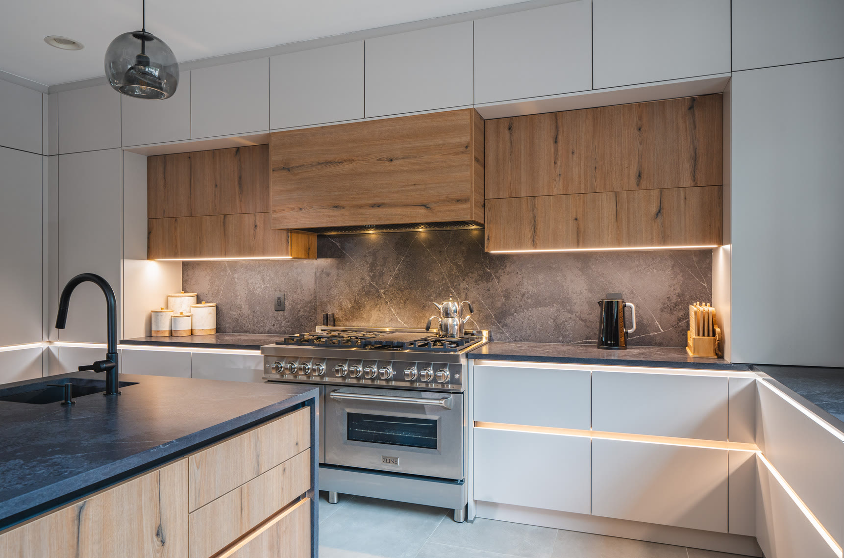
The other reliable version flips it: light perimeter cabinets, both upper and lower, with the island as the one darker or wood element. That is the pairing most people picture when they say two-tone, and it is genuinely hard to get wrong because the perimeter stays quiet and the island carries all the character.
How do you pair wood and painted finishes?
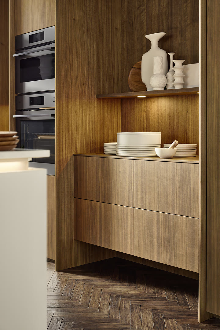
This is where I spend the most time, because a wood grain plus a painted color is the combination that reads as warm and modern without looking like a showroom stunt. The trick is to let the wood be the loud one and keep the paint quiet.
Two pairings come up again and again, and I trust them because I have seen them installed, not just rendered. Walnut with cashmere is one. The walnut brings a deep brown grain and the cashmere is a soft, warm off-white that never fights it. Oak with cashmere is the lighter cousin: oak reads honey or sand rather than brown, and the same cashmere tone sits with it comfortably. Both of these are forgiving because cashmere is close to neutral, so it supports the wood instead of competing.
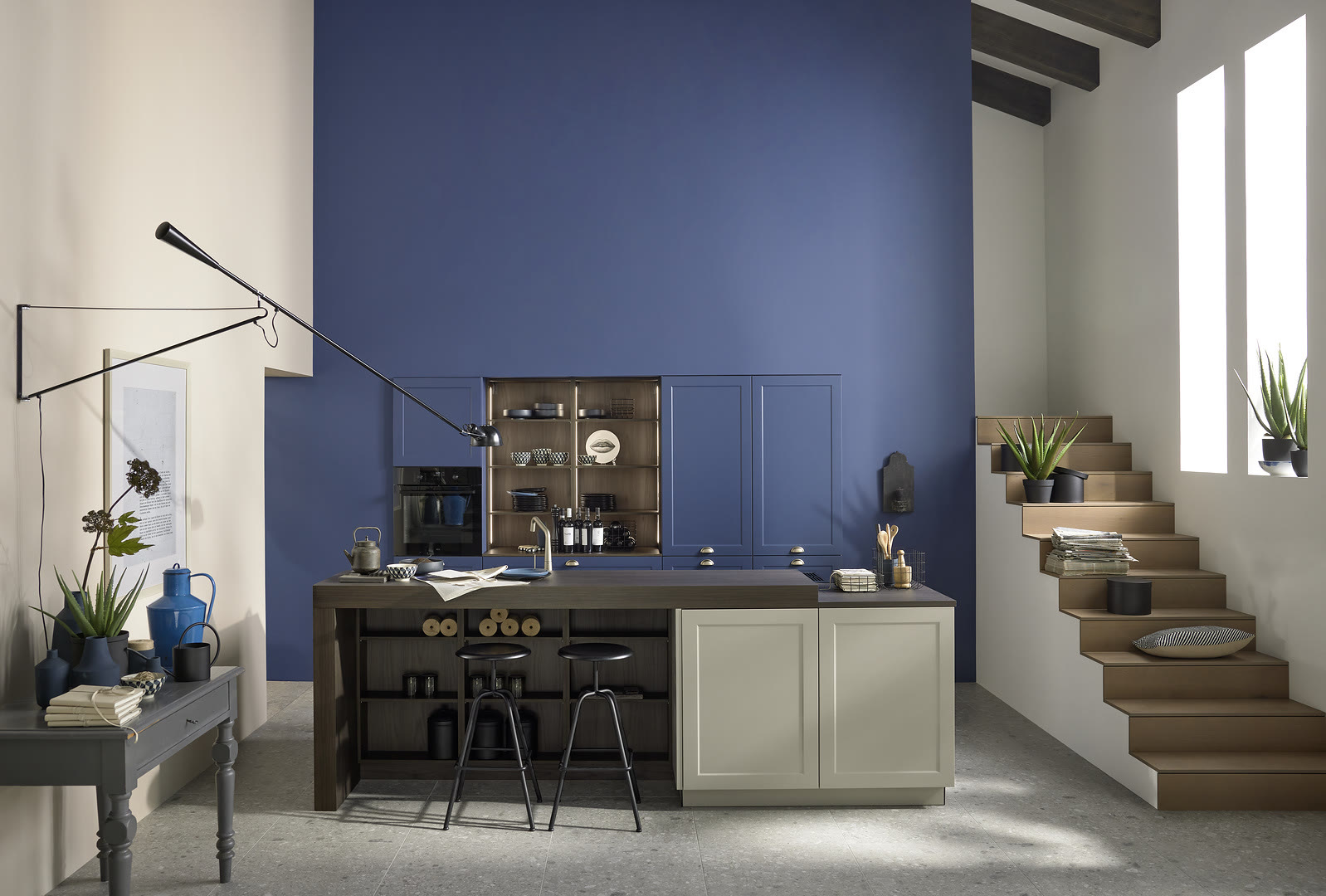
What I steer people away from is two saturated painted colors together, like a strong green lower with a strong blue upper. It can be done, but it has to be art-directed to the inch, and most families want a kitchen they can live in, not maintain like a gallery. If you love color, put it in one place and let the rest go quiet. We cover grain and finish choices in more depth in our guide to walnut kitchen cabinets and countertop pairings, which is worth reading alongside this.
Where should the island color go?
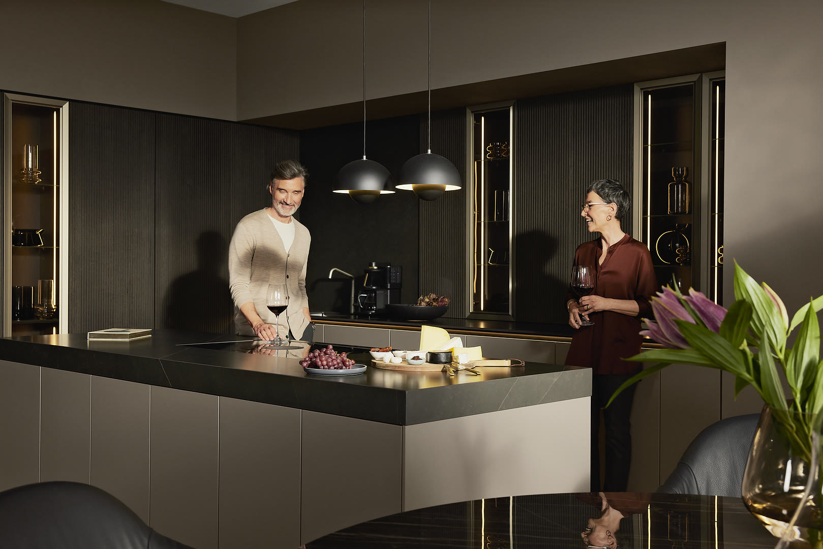
The island is the right place to take your one risk. It sits in the middle of the room as its own object, almost a piece of furniture, so a stronger color there does not wrap around you the way a wall of cabinets would. A client can commit to a deep green or a blackened oak island and still feel calm, because the perimeter stays neutral and the island is something you walk up to rather than something that surrounds you.
A few practical notes. Keep the island countertop either matching the perimeter or one clear step quieter, so the color does the talking and the stone does not add a second argument. If your kitchen is open to a living room, remember that the island color is the thing the seating area sees most, so choose it for how it looks from the couch, not only from the cooktop. And size matters: a small island can disappear under a dark color, while a long one can carry it easily. If you are still working out island proportions, our note on kitchen island dimensions and seating pairs well with the color decision.
How do you test samples under your own lighting?
This is the step people skip, and it is the one that saves the most regret. Cabinet colors shift under light. A warm white that looks clean under the showroom lights can go yellow under a kitchen's warm bulbs, and a cool gray can turn blue near a north-facing window. The photo that sold you on a pairing was lit by a professional. Your kitchen will not be.
So take real door samples home. Not a chip the size of a credit card, the largest samples you can get. Set them up in the actual kitchen, lean the darker one low and the lighter one high so you are seeing them in the positions they will live in. Then look three times: in the morning with daylight, in the evening with your own fixtures on, and on a gray day. Put them against your real floor and your countertop sample, because those are colors too, and a pairing that works on a white showroom wall can fall apart on a dark wood floor.
I also tell people to live with the samples for a few days rather than judging in one afternoon. The eye adjusts. A combination that feels bold on day one often settles into something you stop noticing, which is exactly what you want from a kitchen you will use every day. European cabinet lines give you a wide finish range to sample from, and if you want context on why that matters, our piece on European kitchens in America explains the finish systems behind these colors.
What I tell clients not to do
A few honest cautions. Do not go two-tone just because the internet says to. A single-color kitchen done well is better than a two-tone kitchen done nervously. Do not split the color across a run of cabinets that is too short to read as intentional, because then it just looks like you ran out of one finish. And do not let the appliances become a third accidental color: stainless, black, and paneled fronts all count, so decide early whether the fridge and ovens join the light team or the dark team.
When two-tone is right, it is because it solves something. It grounds a tall room, it adds warmth to an all-white plan, or it gives an open-concept island a reason to feel like its own zone. Start from the problem you are solving, pick two finishes that answer it, test them under your own light, and the result will still feel right long after the trend articles have moved on.
If you want to hold real walnut, oak, and cashmere samples side by side and see them under lighting you can adjust, come see us. We keep the full finish range in the showroom and can lay a two-tone pairing out against stone and flooring before you decide anything.
Frequently Asked Questions
Will a two-tone kitchen look dated in a few years?
How many colors is too many?
Should uppers or lowers be the darker color?
Can I match a wood finish to my existing floor?
Keep Reading

Walnut Kitchen Cabinets: Grain, Finishes and Countertops
How to choose walnut kitchen cabinets: reading grain and tone, veneer versus solid wood, and the countertops that pair with Walnut Rosado and Havana.

European Kitchens in America: The Perfect Match for Timeless Elegance
European kitchens are no longer just a continental design statement; they have found a thriving home in America. From sleek, handleless cabinets to precision-engineered storage, these…

Kitchen Island Dimensions: Size, Seating and Clearance
A practical guide to kitchen island dimensions: minimum size, seating width, work aisles, appliance clearance, and when an island will not fit the room.
Ready to talk through your remodel?
Visit our showroom or request an estimate. We will walk you from first ideas to final installation.