
Choosing a Custom Cabinet Color That Will Last 10 Years
How to choose a cabinet color that ages with your kitchen

Sam K. · Showroom Manager
· 5 min read

A cabinet color is really a ten-year decision, and the one that tends to stay right is a soft neutral with one saturated accent, chosen under the light your kitchen actually gets. The finish matters as much as the color itself. If you compare a matte lacquer panel and a glossy sample side by side, the same color can read like two different choices.
The names that keep coming up across kitchen design are warm oak, pistachio, and cream, but I would not start there. I would start with the finish and the light. You can see more about the current direction in our 2027 cabinet trends article, but a trend is not a reason to commit to a color for ten years.
The finish changes the color more than the chip does
I tell clients to choose the sheen before they fall in love with a color. A deep green in soft-matt lacquer is calm and velvety; the same green in high-gloss reflects light and shows every fingerprint and water spot. Matte and gloss do not age the same way, even when the underlying color is identical.
Lacquer is one of the front options we show in Alexandria, along with solid wood, real wood veneer, metal look, glass, and slate look. Not all lacquer is shiny. The matte versions are the ones I point people toward when they are worried about daily wear. Solid wood and real wood veneer are not the same choice, even when they share a color name. The finish changes the grain, and the grain changes how the light catches the color. I would rather have a client compare a real veneer panel than a printed sample, because the printed sample usually makes the color look cleaner than it is.
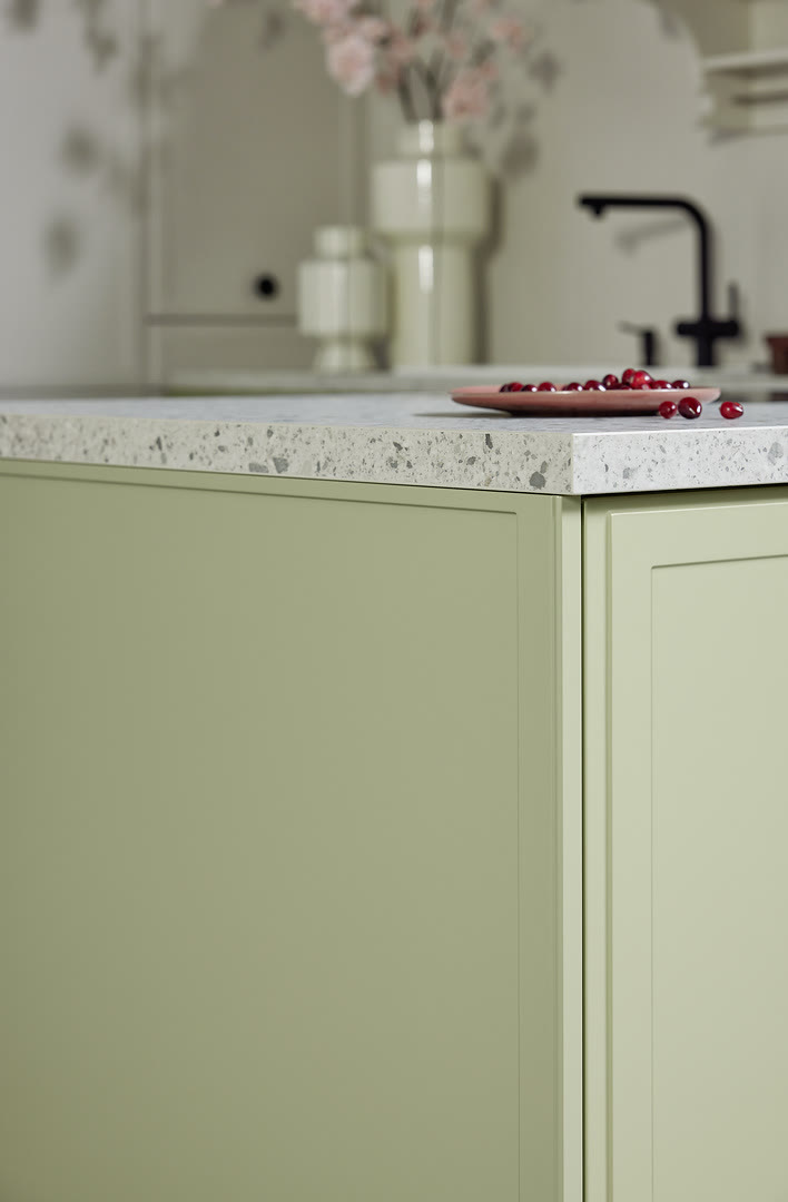
One thing I like about the Nolte matte lacquers is that they are designed to resist fingerprints. That sounds like a small thing, but it is not. A softer sheen also tends to look quieter in a kitchen than a full-gloss door, which helps the color read as part of the room rather than as a shiny object.
North light and south light change the same color
A color that looks calm in a bright south-facing kitchen can go flat in a cool north-facing one. North light is steadier and cooler, so warm neutrals like magnolia or greige can keep the room from feeling cold. South light is stronger and warmer; it can wash out pale colors and deepen saturated ones such as avocado or henna red.
This is why I ask which way the windows face before we compare finishes. A panel can look cool at eight in the morning and warm at four in the afternoon. If you only see the sample at one time of day, you are only seeing part of the decision.
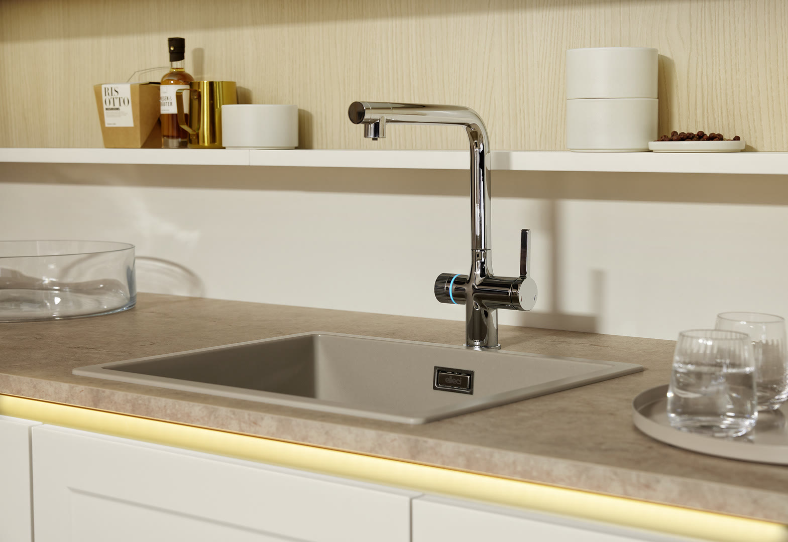
Your kitchen lights matter too. LED strips, under-cabinet lights, and a pendant over the island can all shift how the color appears after dark. If you cook mostly in the evening, test the sample with the lights you will actually use, not just daylight.
A color that looks calm under showroom daylight can go gray in a dim north-facing kitchen, and a pale color can look almost white in a south-facing one. That is why I suggest moving the sample between the sunniest and darkest corners of the room.
Why sampling in the showroom beats a photo or a paint chip
Photos flatten sheen, and paint chips ignore it altogether. I watch clients settle on a color only after they stand in front of a full-size door, then walk toward the window and look again. Our Alexandria showroom carries the finishes so you can compare them under real light.
Every finish is on the showroom floor, so you do not have to imagine the difference between cashmere, greige, magnolia and a deep green like avocado or pistachio. The showroom is open Monday to Friday 10 to 6 and Saturday 10 to 4; Sundays are by appointment if you want a quieter time to compare.
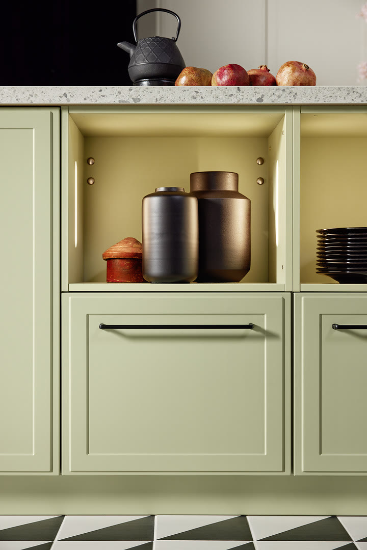
The Alexandria showroom also holds full-size cabinet displays, so you can open drawers, test soft-close hardware, compare matte lacquer against real wood grain and metal, and see how finishes read under real light. That part matters more than the color names. Bring a countertop sample and a floor sample with you if you can. Holding a cabinet color against the real materials in the room tells you more than a photo or a website image.
How to test a color without overcommitting
I usually suggest a two-step test. First, choose a neutral base for the tall run and a saturated accent for the island or a tall pantry. This keeps the kitchen from feeling like a showroom display and gives you one place where the color can be a little braver. Second, bring the finish sample into the room at the times of day you actually cook, and look at it next to the countertop, the floor, and the wall paint.
For clients who want a little green without going mint or sage, Focus Pistachio is a new color for 2027, and it is a soft green that sits between the two. Avocado from the Torino range is a deeper, more confident green. If you like a warmer direction, henna red and caramel are two lacquer colors worth comparing beside the wood tones in your room.
If you want to compare a few colors, ask for a narrow sample door rather than a printed sheet. A three-dimensional panel catches the light differently, and it shows the true depth of a matte lacquer.
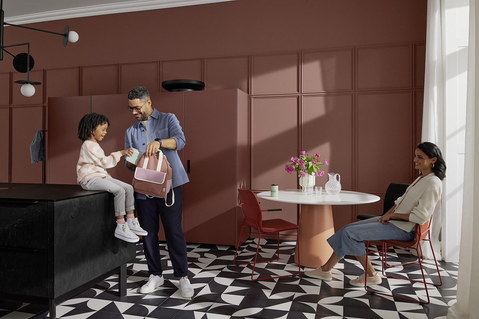
I try to get clients to separate what they love from what they can live with. You can love a bright tomato-red kitchen in someone else's photo and still not want to cook in it every morning. A neutral base with one strong accent gives the room a point of view without asking the next buyer to love the same color as much as you do.
The color that lasts is rarely the most memorable one. It is the one that still feels like your kitchen when the sun comes through the window and the cooktop is on. If you are ready to compare the actual collection, our custom cabinet colors page walks through the available finishes, and the showroom is the place to test the finish before you commit.
Frequently Asked Questions
Can I choose a custom cabinet color?
What is the difference between matte and lacquer kitchen cabinets?
Should I choose a neutral or a bold color for resale?
Can I see and compare the actual cabinets before I order?
Keep Reading

2027 Kitchen Cabinet Trends: Warm Oak, Pistachio and Cream
German cabinetry for 2027: warm oak, a soft pistachio green and cream stone looks, with cabinets that run floor to ceiling. What changes in your plan.

White Oak Kitchen Cabinets: Grain, Finish, and Care
White oak cabinets can look better with age if you choose the right grain cut and finish. Here is what to check before you order, and how to keep them looking.

White Bathroom Vanities: High-Gloss vs Matte Finish
High-gloss white reflects light and shows smudges; matte white hides them but reads softer. Here is how to choose between them.
Choosing kitchen cabinets?
See our custom European cabinetry, or request an estimate for your kitchen.