
Matching Quartz Countertops to Your Bathroom Vanity Color
How I help clients pick a slab that agrees with the cabinet instead of fighting it

Sam K. · Showroom Manager
· 5 min read

The short answer I give clients at the showroom is this: choose your vanity cabinet color first, then pick a quartz slab that either quiets it down or gives it exactly one clear contrast. The countertop and the cabinet do not need to match. They need to agree. Most of the pairings that go wrong are not ugly colors, they are two elements trying to be the star at the same time.
I talk about this pairing almost every week, so let me walk through how I think about it, what works with the common cabinet colors, and the couple of mistakes I steer people away from.
How do you match a quartz countertop to a vanity color?
Start with the cabinet, because the fronts are the biggest color surface in the room and the hardest thing to change your mind about later. Once the cabinet color is set, the countertop has one job: decide whether the vanity feels calm or feels bold.
There are really two moves. The first is to keep the top close in tone to the cabinet so the whole piece reads as one quiet block. The second is to let the top be the single point of contrast, a lighter stone over a dark front, or a veined slab over a plain one. Both are good. Trouble starts when a client tries to do both jobs at once: a strong cabinet color and a strong countertop pattern and a strong backsplash. That is three voices in a small room.
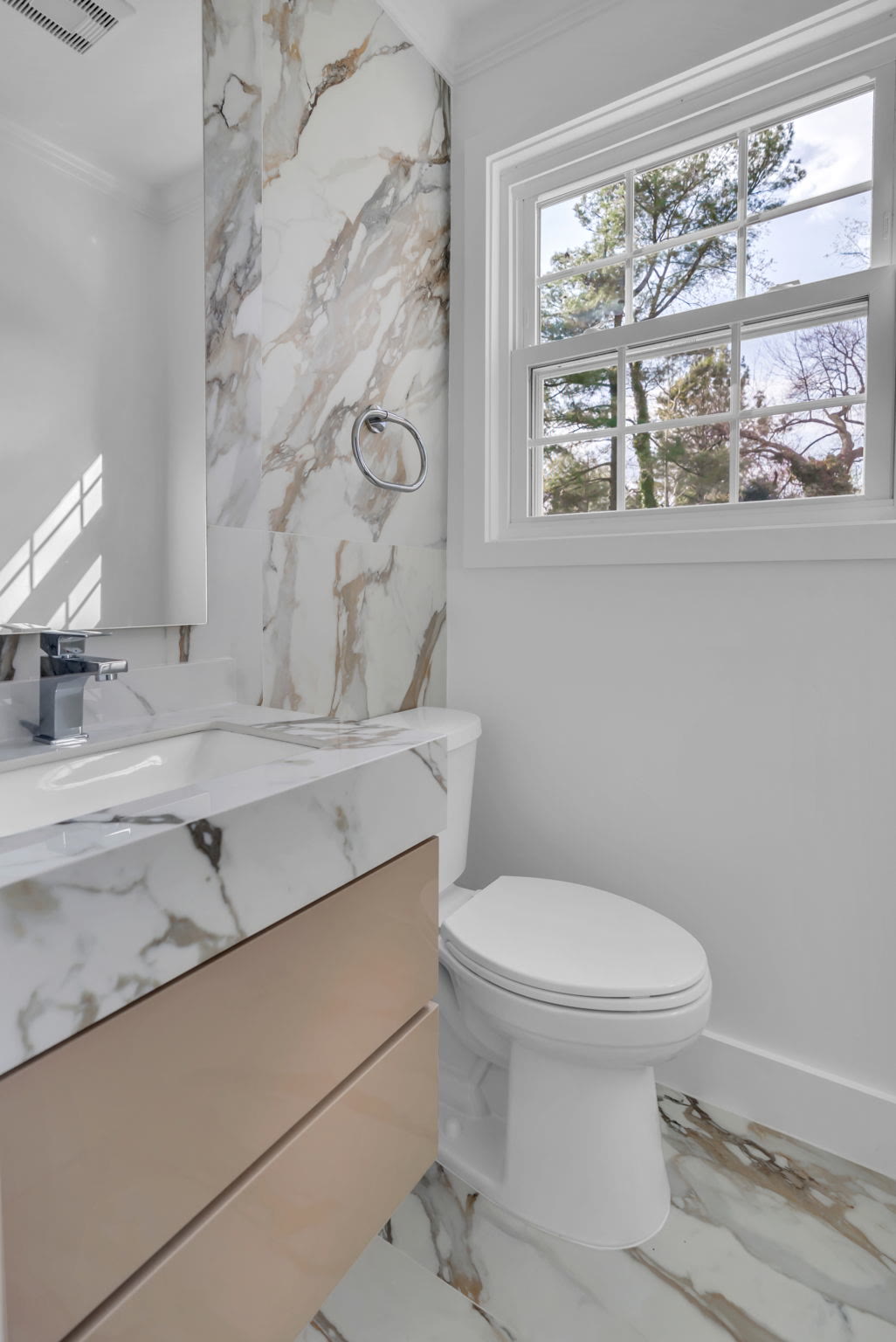
One thing I remind people: on a bathroom vanity you are working with a small slab. Unlike a kitchen, where a long run shows a lot of the stone, a 24 or 32 inch top only reveals a modest piece. A pattern that looks balanced on the full slab can land unevenly once it is cut down. Ask the fabricator where the vein will fall on your piece.
What countertop works with a white vanity?
White is the easy one and the deceptive one. A white cabinet takes almost any countertop, so the countertop becomes the decision that sets the mood. That freedom is nice until it turns into paralysis.
If you want the vanity to feel soft and warm, a cream or a gentle marble-look quartz over white keeps everything in the same family. If you want it crisp and modern, a charcoal or a slab with real veining gives the white something to push against. Both are correct. The question I ask is what the room next to the vanity is doing. A busy floor tile or a bold wall usually means the countertop should stay calm. A plain room can carry a stronger top.
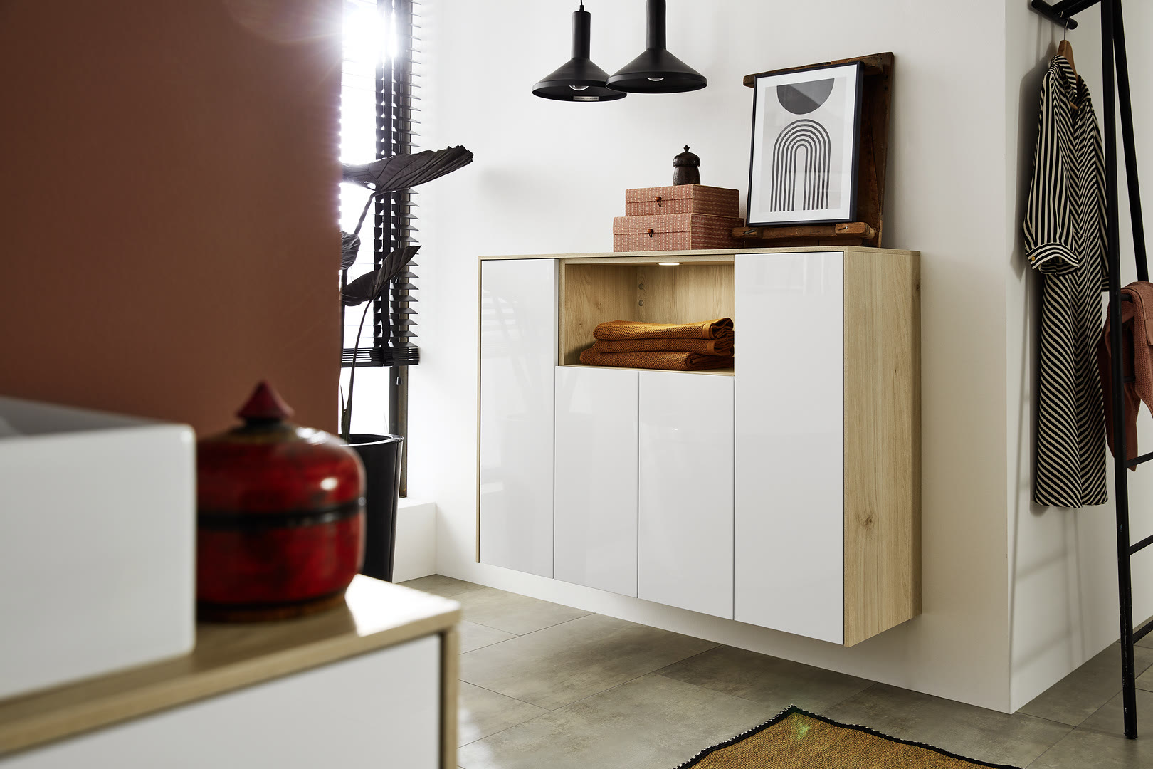
If you are still deciding between a shiny or a flat white cabinet, that choice changes how the top reads too, and I get into it in our piece on high gloss versus matte white vanities. A high-gloss front bounces light and makes a top look brighter. A soft matte front keeps things quieter and pairs easily with a warmer stone.
What about dark, graphite, and wood vanities?
Dark and wood fronts already carry a lot of visual weight, so the countertop usually does its best work by staying calm. On a graphite or black vanity, a light stone gives a clean line where the two meet, and that contrast is often the whole point of the design. A heavily veined slab on top of a strong dark cabinet tends to muddy both.
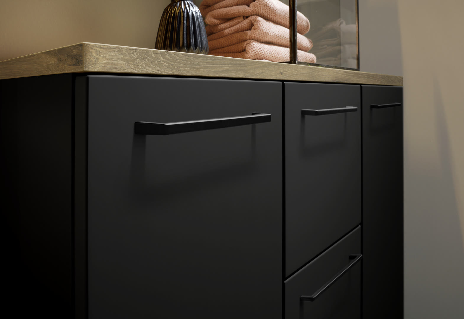
Wood fronts are their own case. The grain is already a pattern, so I almost always pair oak or walnut with a plain or lightly textured quartz. Let the wood be the interesting thing and let the stone support it. A white or a soft grey quartz over natural oak is a pairing I set up over and over because it just works. If you are weighing light against dark wood, our note on oak vanities in a modern bathroom covers how the tone changes what top to choose. And for colored fronts like navy or green, the same rule holds: keep the stone quiet, which is the thread through our color pairing guide.
Match, contrast, and what I tell clients to skip?
Here is the framework I hand people. Decide up front whether the countertop is a match or a contrast. If it is a match, keep it within a shade or two of the cabinet and let the room's texture do the work. If it is a contrast, make it a real contrast, not a near miss. A top that is almost the cabinet color but not quite is the pairing that looks like a mistake rather than a choice.
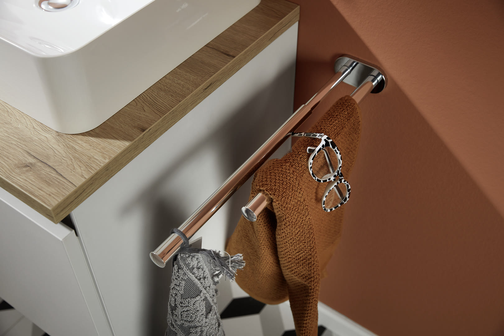
The mistakes I actively talk people out of are short. First, do not pick the slab under showroom lights alone. Quartz and lacquer both shift under warm bulbs, so I have clients bring a door sample home and look at the pairing in their own bathroom light. A match that looked clean can go faintly green or pink. Second, do not stack three patterns. If the floor is busy, the top should be calm, and the other way around. Third, do not chase a dramatic vein on a tiny top. You will only see a sliver of it, and it rarely lands where the photo showed.
None of this is complicated once the cabinet color is fixed. The countertop is a supporting decision, and treating it that way is what keeps a bathroom feeling put together instead of loud. If you want a second set of eyes on a pairing, that is exactly the kind of thing we sort out early in a bathroom design build, before anything gets cut.
Frequently Asked Questions
Should my quartz countertop match my vanity cabinet exactly?
What quartz goes best with a white vanity?
Does a busy veined quartz work on a small vanity?
How do I judge the color match before buying?
Keep Reading

Floating Bathroom Vanity: A Complete Buyer's Guide
A floating bathroom vanity mounts to the wall with open floor beneath it. Here is how to choose one, what it costs you in planning, and where it goes wrong.

36 Inch Bathroom Vanity vs 40 Inch: Which Fits Your Wall
A 36 inch vanity is the American standard and a 40 inch is the European one. Here is how to measure your wall and pick the right one.

30 Inch Bathroom Vanity: Fit, Sizes, and When 32 Works
A 30 inch vanity fits most guest and secondary baths, but the European 32 inch often uses the wall better. Here is how I help clients choose.
Ready to talk through your remodel?
Visit our showroom or request an estimate. We will walk you from first ideas to final installation.